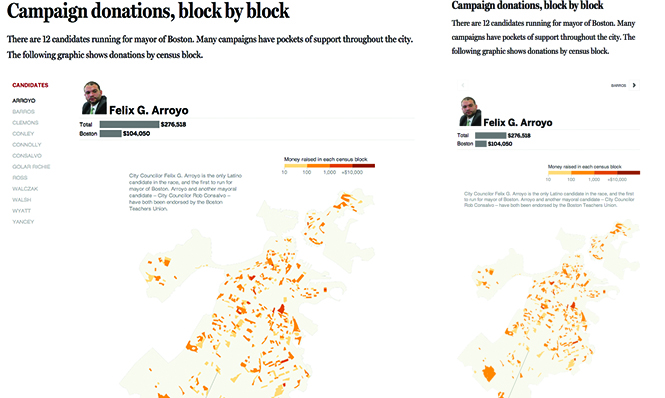
Accessing interactive graphics on small, smart phone screens versus a large desktop computer screen results in two very different user experiences. Responsive design – designing content to provide an optimal viewing and interaction experience across a wide range of devices – is a common way to address this. In other words, your graphic may be restructured or even simplified for smaller screens so that type and visuals are easy to read and interaction is comfortable and easy to achieve. Additionally, buttons and other interactive elements may be redesigned to better function in a touch-screen environment.
This responsive graphic created by the Boston Globe restructures to adjust to smaller screen sizes. The navigation changes from a vertical menu to a single button that allows users to click linearly from candidate to candidate. This adjustment makes the graphic more space conservative and easer to navigate on a small screen.
Click here to explore the Boston Globe’s campaign donation graphic.


Recent Comments