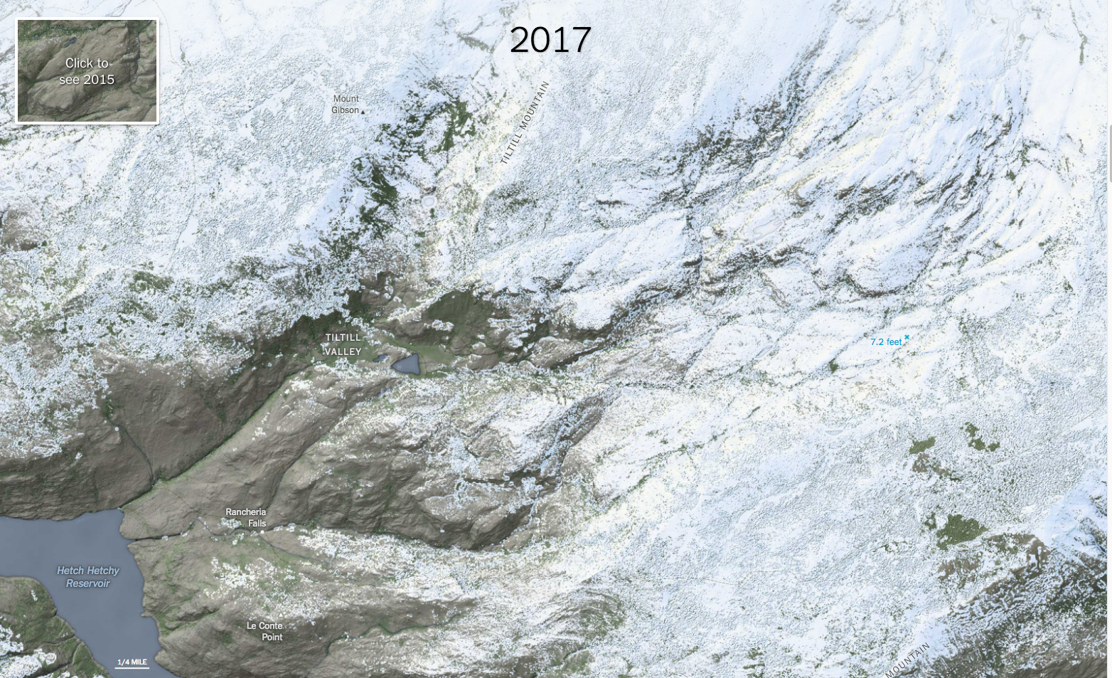
Interactive maps can use data to create physical manifestations of something that might seem abstract at first. The New York Times took data gathered by NASA’s Airborne Snow Observatory to create interactive maps that show the current state of the drought in the Sierra Nevada mountains. They used NASA’s data to compare the snow that accumulated during the winter of 2017 to the snow accumulation during 2015, which was a much drier year. Then, they superimposed the data onto aerial maps of two different areas in the Sierra Nevadas. In a single click, a user can switch back and forth to compare the snowfall between the 2017 and 2015.
The snowfall in the Sierra Nevadas has a huge impact on the ongoing drought in California. One of California’s main water supplies is melted snow, so when there is very little snow, like in 2015, the drought intensifies. With the increased snowfall in 2017, it is possible that the drought is lessening. Unlike a satellite image, these interactive maps use data gathered throughout the entire winter to show overall amounts of snowpack. The legend is very simple – if an area is white, then there was a meter or more of snow in that area. With a single click, a user can see a visceral image that shows just how much more snow fell in 2017. It’s one thing to read that 10 times the amount of snow fell in 2017 than in 2015, and it’s another thing entirely to see what impact that has on a geographical area. In this particular instance, data visualization gives a physical face to data that has ramifications across the country.

Recent Comments